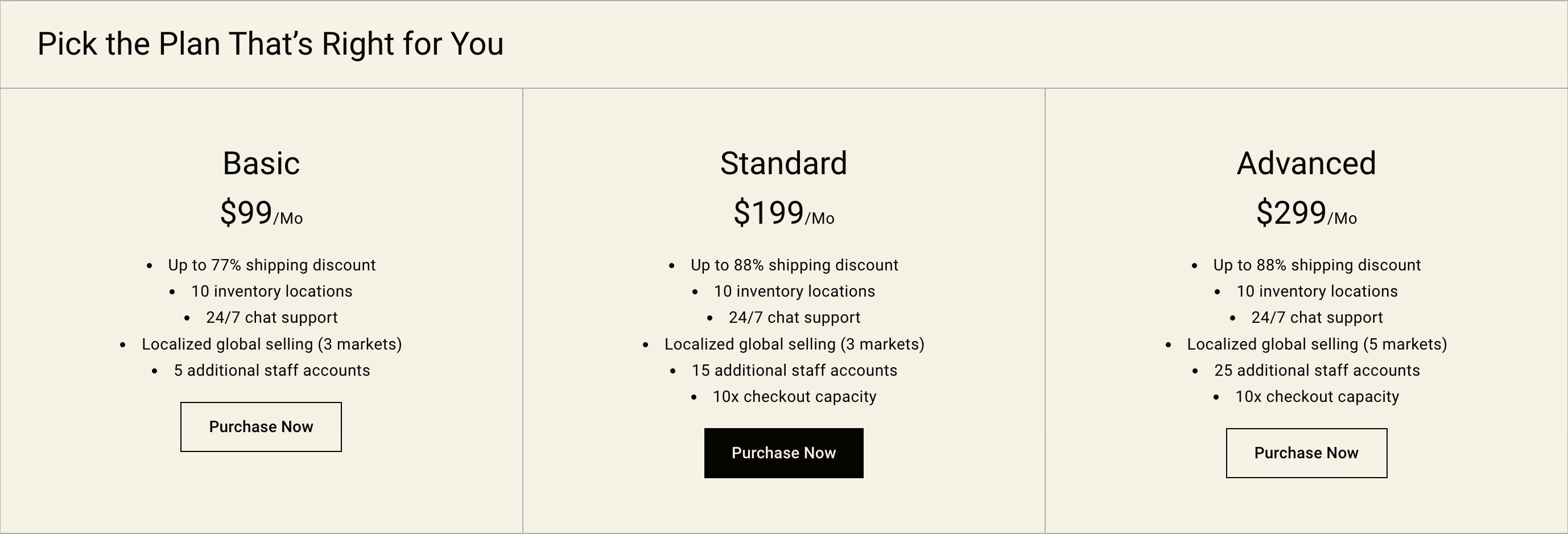
Overview
A custom widget that lets you create a whole range of differently presented pricing tables.
Section settings
| Setting |
Description |
| Spacing position |
Choose from:
- None
- Top
- Bottom
- Top and Bottom
|
| Mobile layout |
Choose between Horizontal and stacked. |
| Color scheme |
A set of colors that you can apply to this section. Learn more about color schemes. |
| SECTION HEADER |
|
| Heading |
The heading of the section. |
| Heading size |
Set the height of heading using the drop-down menu:
|
| Button label |
Enter text for a button, or leave blank to hide the button entirely. |
| Button link |
The URL that you want the button to link to. |
| GRID |
|
| Number of columns on desktop |
Number of columns to display on desktop computers. Minimum: 1. Maximum: 6. |
| Number of columns on mobile |
Set a specific column layout for mobile devices When Layout mobile is stacked. Choose between 1 and 2 columns. Visible when the Mobile layout setting is set to Stacked. |
Pricing plan block
| Setting |
Description |
| Desktop content position |
Choose from Top, Middle and Bottom. |
| Link |
The URL that you want the block to link to. |
| Heading |
Optional heading text for the block. Text is added to each block individually. |
| Heading size |
The font size of the heading: Small Medium(Default) Large |
| Subheading |
Optional subheading text for the block. Text is added to each block individually. |
| Price |
Optional price text for the block. Text is added to each block individually. |
| Price size |
The font size of the block: Small Medium(Default) Large |
| Description |
Optional description text for the block. Text is added to each block individually. |
| Button label |
Enter text for a button, or leave blank to use the collection title. |
| Button style |
The style of the button. Choose from Primary, Outline and Underline. |