Overview
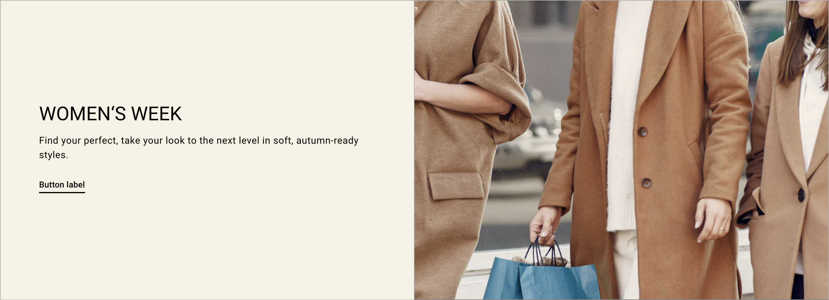
Display your images & projects in vertically scrolling reels with accompanying text that switches along.
Section settings
| Setting |
Description |
| Spacing position |
Choose from:
- None
- Top
- Bottom
- Top and Bottom
|
| Image |
|
| Image ratio |
The ratio for the image:
-
Adapt to image - Uses the aspect ratio of the images. This prevents the images from being cropped.
- Adapt to first image
- 2:3
- 3:4
- 1:1
- 4:3
- 16:9
- 21:9
|
| Desktop image position |
Choose between Left and Right. |
| Mobie image position |
Choose between Top and Bottom. |
| Content |
|
| Text alignment |
Choose from Left, Center and Right. |
| Desktop content position |
Choose from Top, Middle and Bottom. |
Image with text block
| Setting |
Description |
| Color scheme |
A set of colors that you can apply to this section. Learn more about color schemes. |
| IMAGE |
|
| Image |
Static image for your slideshow. Click Select Image to view your media library, or click the Change button to change or remove the image. |
| Edit alt text |
Describe the slideshow image and provide context for customers using screen readers. |
| Link |
The URL that you want the image to link to. |
| Text |
|
| Heading |
Optional heading text for the image. Text is added to each image individually. |
| Heading size |
The font size of the heading: Small Medium(Default) Large |
| Subheading |
Optional subheading text for the image. Text is added to each image individually. |
| Description |
Optional description text for the image. Text is added to each image individually. |
| FIRST BUTTON |
|
| Label |
Enter text for a button, or leave blank to hide the button entirely. |
| Link |
The URL that you want the button to link to |
| Style |
The style of the button. Choose from Primary, Outline and Underline. |
| SECONDARY BUTTON |
|
| Label |
Enter text for a button, or leave blank to hide the button entirely. |
| Link |
The URL that you want the button to link to. |
| Style |
The style of the button. Choose from Primary, Outline and Underline. |