Overview
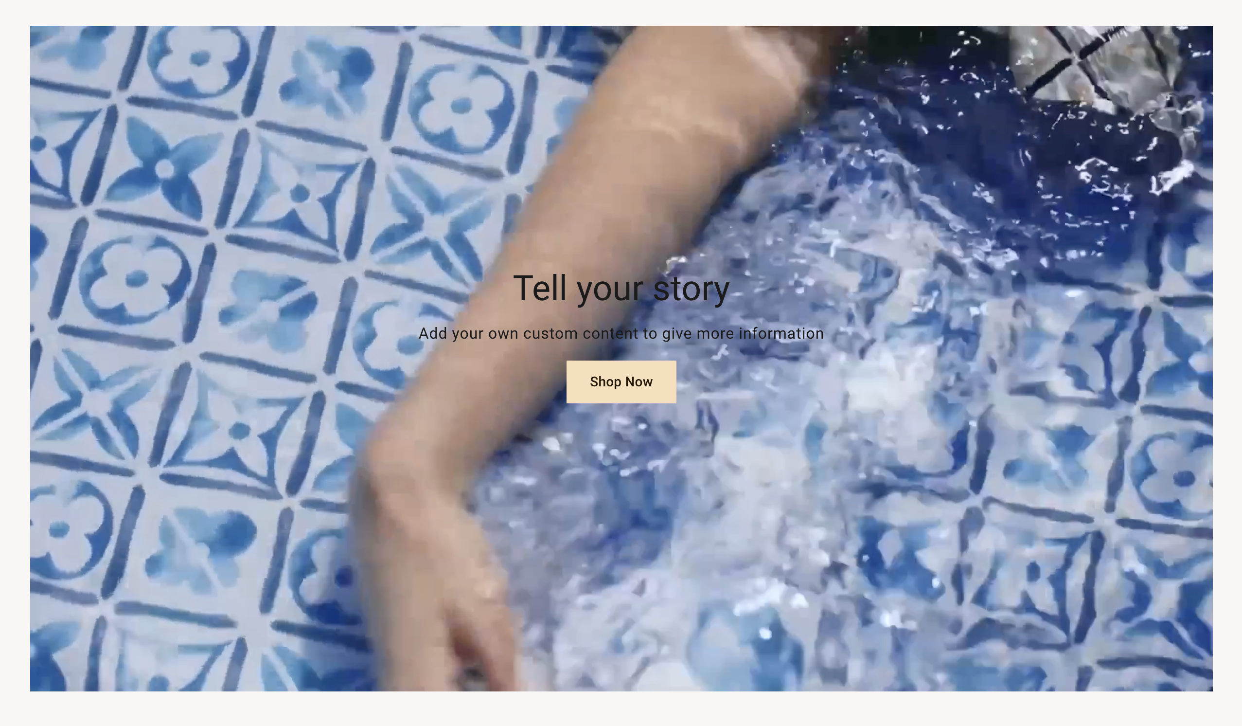
The section supports video, heading, subheading and buttons.
Section settings
| Setting |
Description |
| Section width |
Set the width of the section using the drop-down menu:
- Grid
- Full width
- Full width no gap
|
| Section spacing |
Set the spacing of the section using the drop-down menu:
Visible when the Section width setting is set to Grid. |
| Video |
|
| Video |
Add or select your own video to the section. |
| Overlay opacity |
Adds an overlay to the video. Use the slider to set the opacity of the overlay. Defaults to 0%. |
| Video mobile |
Add or select your own video to the section for moible view. |
| Overlay opacity mobile |
Adds an overlay to the video. Use the slider to set the opacity of the overlay. Defaults to 0%. |
| Link |
Give the video a link when there is no content on it. |
| Content |
|
| Content position |
The position of the content above the video. Choose from the drop-down menu:
- Top left
- Top center
- Top right
- Middle left
- Middle center
- Middle right
- Bottom left
- Bottom center
- Bottom right
|
| Text color desktop |
Set color text on desktop view |
| Text color mobile |
Set color text on mobile view |
Heading block
| Setting |
Description |
| Text |
Title text for the section. |
| Heading size |
The font size of the heading, Choose from the drop-down menu:
|
| Color |
Set the color for heading text |
| Link |
The URL that you want the heading to link to. |
Subheading block
| Setting |
Description |
| Text |
Subheading text |
| Color |
Set the color for subheading |
Description block
| Setting |
Description |
| Text |
Displays paragraph-style text. |
| Color |
Set the color for description |
Button block
| Setting |
Description |
| Label |
The text that displays on the button. |
| Link |
The URL that you want the button to link to. |
| Style |
The style of the button. Choose between Primary and Secondary |