Overview
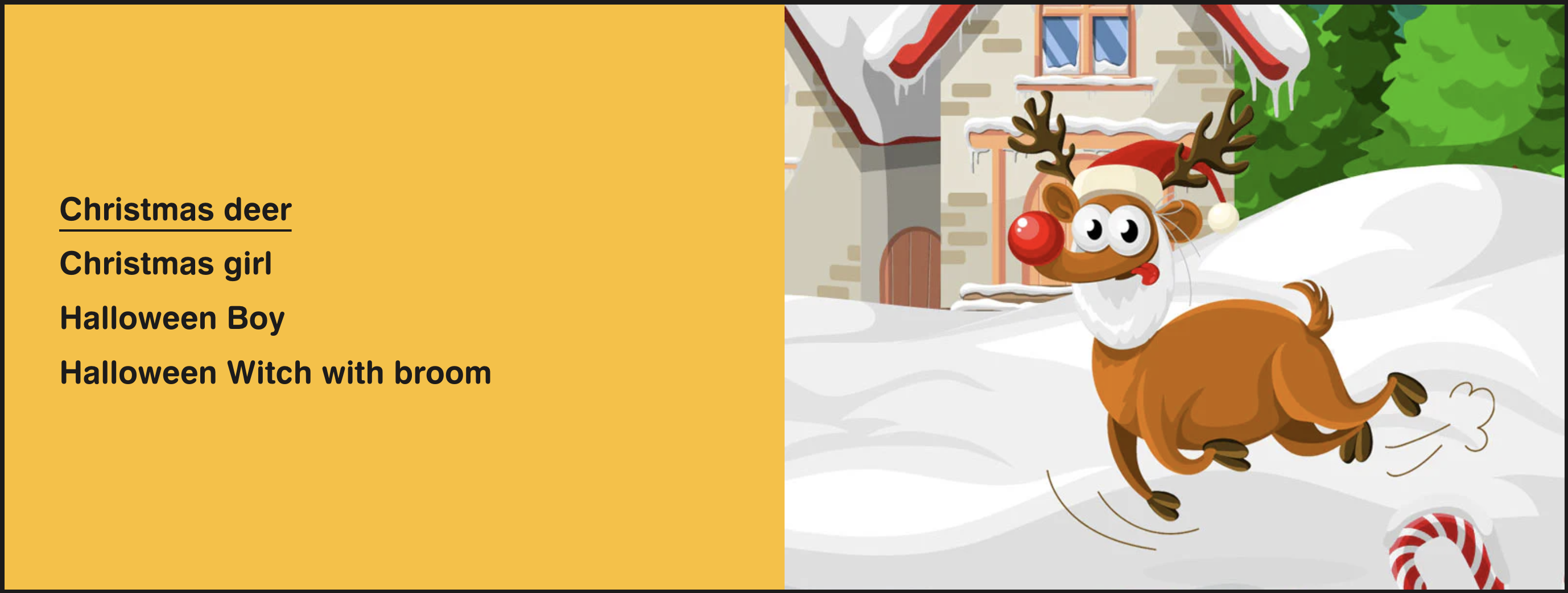
Ideal for displaying linkable interactive text with images that appear on text hover in a number of varied ways.
Section settings
| Setting |
Description |
| Section width |
Set the width of the section using the drop-down menu:
- Grid
- Full width
- Full width with gaps
|
| Show top outline |
Displays the top outline of the section. |
| Show bottom outline |
Displays the bottom outline of the section. |
| Color scheme |
Set the color scheme of the section using the drop-down menu:
- Background
- Primary
- Secondary
- Tertiary
- Custom
|
| Background color |
Set the background of the section,visible when the Color scheme setting is set to Custom. |
| IMAGE |
|
| Image ratio |
The ratio for the image:
- Adapt to image - Uses the aspect ratio of the images. This prevents the images from being cropped.
- Adapt to first image
- 2:3
- 3:4
- 1:1
- 4:3
- 16:9
- 21:9
|
| Image width |
Set the width of the image. Defaults to 50%. |
| Image position |
Choose between Left and Right. |
| Links |
|
| Text alignment |
Choose from Left, Center and Right. |
Custom link block
| Setting |
Description |
| Lable |
The label of the link. |
| Link |
URL for the link. Leave empty for no link. |
| Image |
The image that you want to display. |
| Edit alt text |
Add a brief image description to improve SEO and to describe the image for customers using screen readers. |
Products block
| Setting |
Description |
| Products |
Choose the products that you want to show. |
Collections block
| Setting |
Description |
| Collections |
Choose the collections that you want to show. |