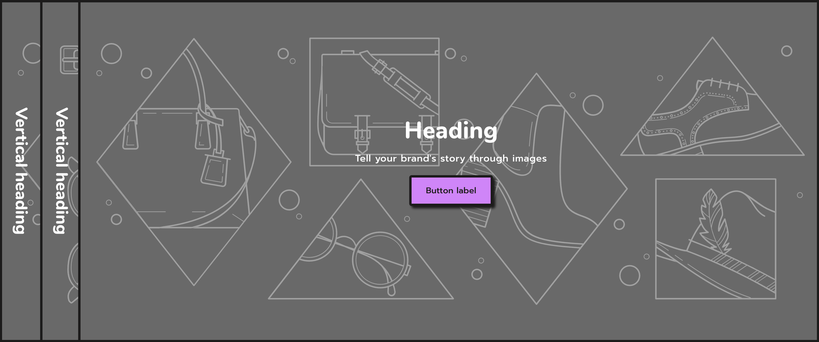
Overview
Easily create interactive banners that give your ads & important messages that special something.
Section settings
| Setting |
Description |
| Section width |
Set the width of the section using:
- Grid
- Full width
- Full width with gaps
|
| Show top outline |
Displays the top outline of the section. |
| Show bottom outline |
Displays the bottom outline of the section. |
| Color scheme |
Set the color scheme of the section using the drop-down menu:
- Background
- Primary
- Secondary
- Tertiary
- Custom
|
| Background color |
Set the background of the section,visible when the Color scheme setting is set to Custom. |
| Accordion height |
The accordion height of the section:
- Adapt to first image
- Small
- Medium
- Large
|
| Vertical heading |
Visible on desktop. |
| Position |
Choose the position of the vertical heading. Options are Left and Right. |
| Alignment |
Choose the alignment of the vertical heading. Options are Top, Center and Bottom. |
| Size |
Set the size of vertical heading using :
|
Accordion block
| Setting |
Description |
| Vertical heading |
The vertical heading of the block. |
| Image |
|
| Image |
The main image for the banner. If the mobile image is not set, this is image is used to display on mobile devices too. |
| Edit alt text |
Click to set image alt text for search engine optimization and to describe the image for customers using screen readers. |
| Image Link |
|
| Link |
Give the image a link when there is no content on it. |
| Content |
|
| Content position |
The position of the content above the image. Choose from:
- Top left
- Top center
- Top right
- Middle left
- Middle center
- Middle right
- Bottom left
- Bottom center
- Bottom right
|
| Subheading |
Optional subheading text for the image. Text is added to each image individually. |
| Heading |
Optional heading text for the image. Text is added to each image individually. |
| Heading size |
The font size of the heading: Small Medium(Default) Large |
| Description |
Optional description text for the image. Text is added to each image individually. |
| Text color |
Set the text color of heading, subheading, description of the block. |
| FIRST BUTTON |
|
| Label |
Enter text for a button, or leave blank to hide the button entirely. |
| Link |
The URL that you want the button to link to |
| Style |
The style of the button. Choose from Primary, Secondary, Outline and Underline. |
| SECONDARY BUTTON |
|
| Label |
Enter text for a button, or leave blank to hide the button entirely. |
| Link |
The URL that you want the button to link to. |
| Style |
The style of the button. Choose from Primary, Secondary, Outline and Underline. |