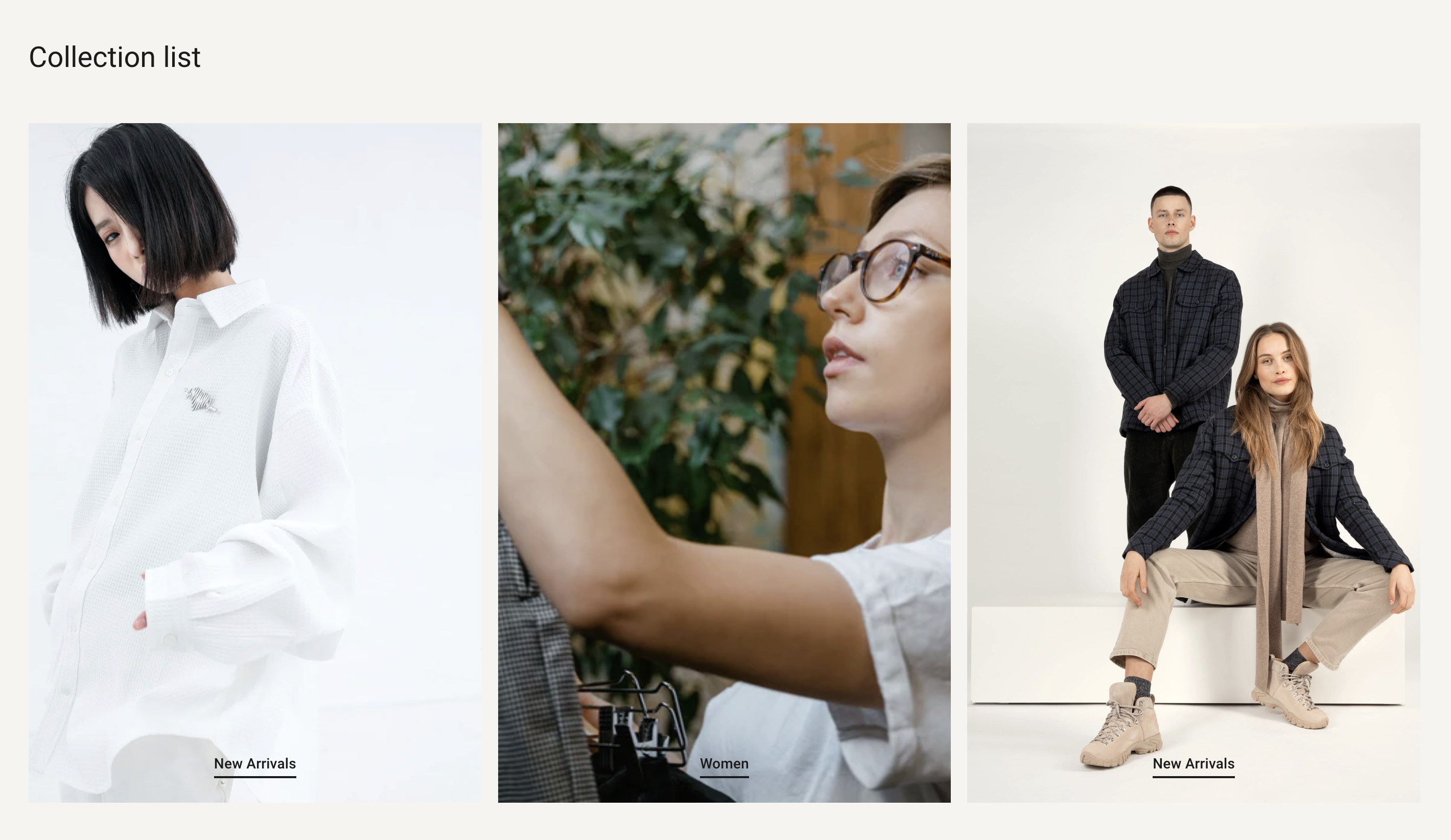
Overview
You can add a list of collections that you want to highlight. You can add up to 16 collection blocks to a collection list.
Section settings
| Setting |
Description |
| Section width |
Set the width of the section using the drop-down menu:
|
| Section spacing |
Set the spacing of the section using the drop-down menu:
|
| Image ratio |
The ratio for the image:
- Adapt to image - Uses the aspect ratio of the images. This prevents the images from being cropped.
- 2:3
- 3:4
- 1:1
- 4:3
- 16:9
- 21:9
|
| Mobile layout |
Choose between Horizontal and Stacked. |
| SECTION HEADER |
|
| Heading |
The heading of the section. |
| Heading size |
Set the height of heading using the drop-down menu:
|
| Subheading |
The subheading of the section. |
| Description |
The descriptino of the section. |
| Button label |
Enter text for a button, or leave blank to hide the button entirely. |
| Button link |
The URL that you want the button to link to. |
| Button style |
The style of the button. Choose between Primary, Outline and Underline. |
| GRID |
|
| Number of columns on desktop |
Number of columns to display on desktop computers. Minimum: 1. Maximum: 6. |
| Number of columns on mobile |
Set a specific column layout for mobile devices When Layout mobile is stacked. Choose between 1 and 2 columns. Visible when the Mobile layout setting is set to Stacked. |
Collection block
| Setting |
Description |
| Collection |
The collection you want to add. |
| Image |
The image for the section. Click Select Image to choose an image, or click the Change button to change or remove the image. |
| Edit alt text |
Add a brief image description to improve SEO and to describe the image for customers using screen readers. |
| BUTTON |
|
| Label |
Enter text for a button, or leave blank to use the collection title. |
| Style |
The style of the button. Choose between Primary and Secondary. |
| Position |
The position of the button. Choose from the drop-down menu:
|