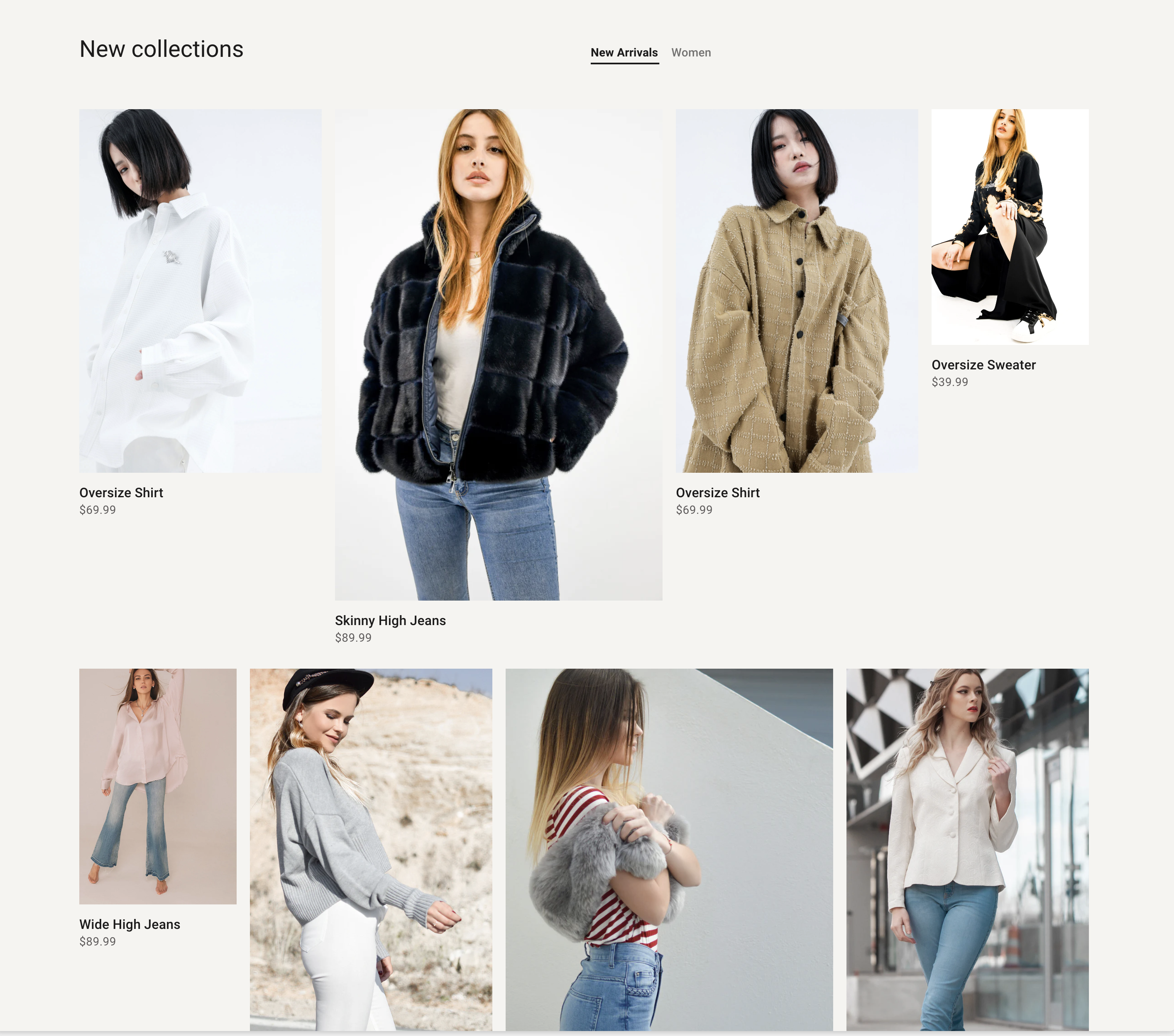
Overview
Tab collections can help you promote sales and new collections.
Section settings
| Setting |
Description |
| Section width |
Set the width of the section using the drop-down menu:
|
| Section spacing |
Set the spacing of the section using the drop-down menu:
|
| Layout |
Choose between Grid and Carousel |
| Section header |
|
| Heading |
The heading of the section. |
| Header alignment |
Choose the alignment of the section heading. Options are Left and Center. |
| Heading size |
Set the height of heading using the drop-down menu:
|
| Subheading |
The subheading of the section. |
| Description |
The description of the section. |
| GRID |
|
| Make items the same width |
Checked to make items have the same width |
| Maximum products to show |
The number of products from the collection to display. Minimum: 2. Maximum: 24. |
| Number of columns on desktop |
Number of columns to display on desktop computers. Minimum: 2. Maximum: 6. |
| Number of columns on mobile |
Set a specific column layout for mobile devices When Layout mobile is stacked. Choose between 1 and 2 columns. Visible when the Layout setting is set to Grid. |
| PRODUCT CARD |
|
| Show product info |
Displays the product info for each product. |
| Show product rating |
Displays the average product rating in stars with the number of reviews in parenthesis, for example: ★★★★★ (8). Also requires a product review app, and metafield definitions for reviews.rating_count and reviews.rating. |
| Show vendor |
Displays the vendor for each product. |
| Show swatch |
Displays the swatch for each product. |
Collection block
| Setting |
Description |
| Collection |
The collection you want to shown. |
| Title |
If you want a new title to replace the default collection title. |